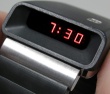
I'll be doing both red and blue displays. But only about 500 watches will be made with the blue one.
As for text, I'm definitely putting somthing to the right. :) I think engraved would be nice (when I picture it in my head). It's possible the manufacture won't do this, I'm just checking with them now. I'm not doing the protruding glued on lettering anymore. I'm always scared those things will come off over time. :)
Jeff
It is currently 13 May 2024, 09:11
What I would like to see in a "NEW LED WATCH"
77 posts
• Page 2 of 4 • 1, 2, 3, 4


Guru

- Posts: 3636
- Joined: 04 Feb 2006, 10:34
- Location: Surrounded by hicks and sticks (farms and woods) - Michigan,USA
Guru
- Posts: 3636
- Joined: 04 Feb 2006, 10:34
- Location: Surrounded by hicks and sticks (farms and woods) - Michigan,USA
Guru
- Posts: 3636
- Joined: 04 Feb 2006, 10:34
- Location: Surrounded by hicks and sticks (farms and woods) - Michigan,USA
Guru
- Posts: 3636
- Joined: 04 Feb 2006, 10:34
- Location: Surrounded by hicks and sticks (farms and woods) - Michigan,USA


Guru
- Posts: 3636
- Joined: 04 Feb 2006, 10:34
- Location: Surrounded by hicks and sticks (farms and woods) - Michigan,USA

77 posts
• Page 2 of 4 • 1, 2, 3, 4
Who is online
Users browsing this forum: No registered users and 35 guests