27 Jun 2010, 06:23
You can't argue with the Big Time as the odd one out for Pulsar styling. That said, my wife says that it's her favorite and it's one of my favs also. The Big Time would look great if it were thinner (by maybe 25%), but it's still a looker. I used to not care for the asymmetry of the P2, but I've gotten over that.
As for my own nominations for ugly ducklings, I'd have to vote for the following:
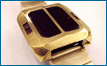
1) non-Euro calc.
I have a hard time getting used to the squat shape of this model. I know it's supposed to be chunky, but it's just so darn squat. The Euro model is easier on the eyes. Maybe it grows on you.
2) Euro ladies models
The touch command Euro designed models take some getting used to. I've come to like the cushion model, but it didn't seem like a Pulsar at first. The "square" and "oval" models are uninspired. Additionally, these later touch command models all have the LED display placed too high in the crystal, which seems like a design flaw.
3) Late touch command models
Again, these don't quite hit the mark. The men's and ladies models with the textured surface and integrated band (7917 and 6931) have a nice shape and finish, but the display is off-center. The vertical format "cushion" models (7918, 6921, look a bit like a TI 104) seem plain - neither futuristic nor elegant - they don't seem like they know what they want to be.
4) LCD models
It seems odd that the display is located at the bottom of the watch face and the watch can't decide whether to be square or round.
No real surprises here. I'd like to say that my aesthetic taste is out of the mainstream, but the watches that are seen as the "classics" also tend to seem the most inspired, design-wise.
Jean Wuipschard managed to bat almost 1000, an amazing feat!
-abe.